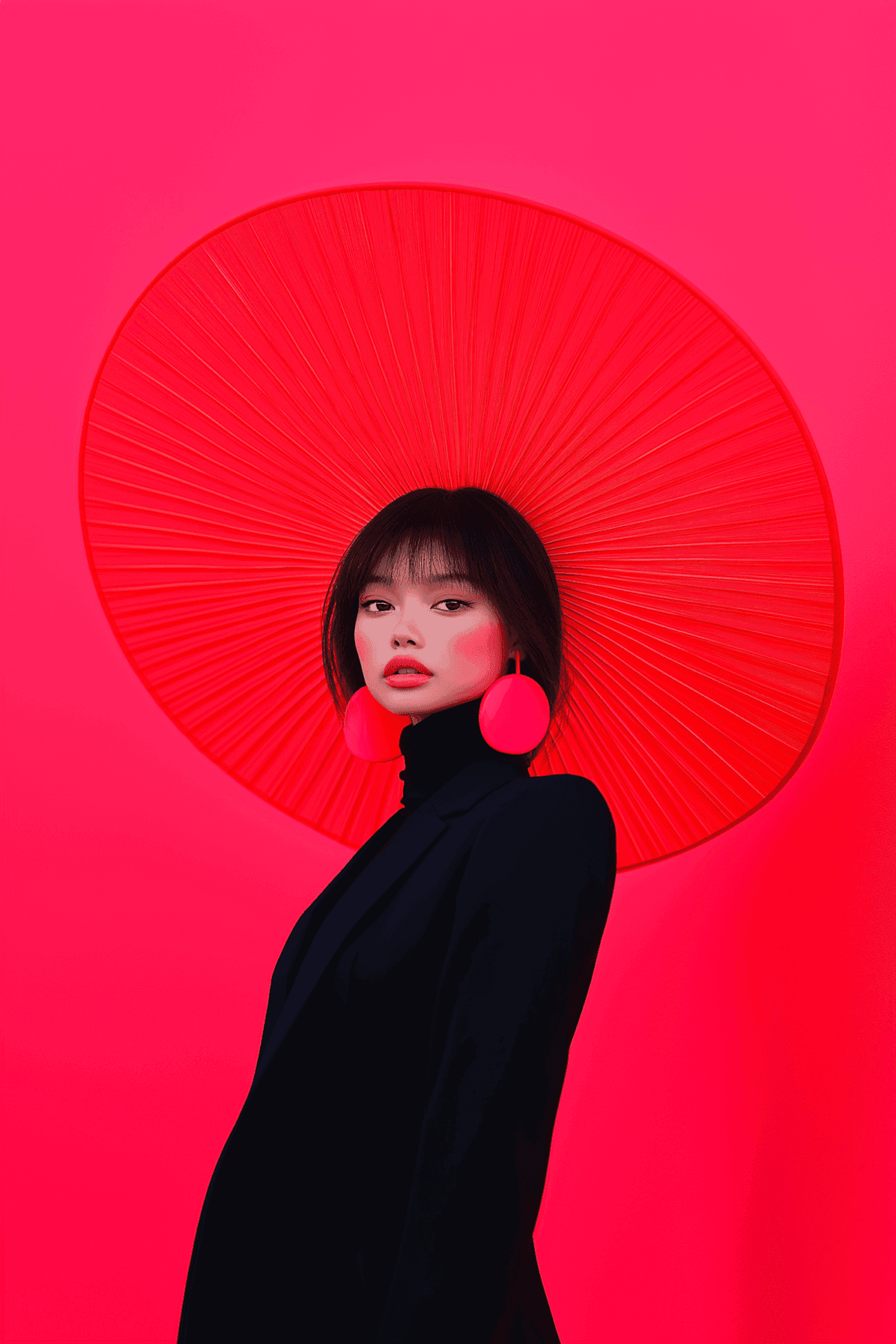
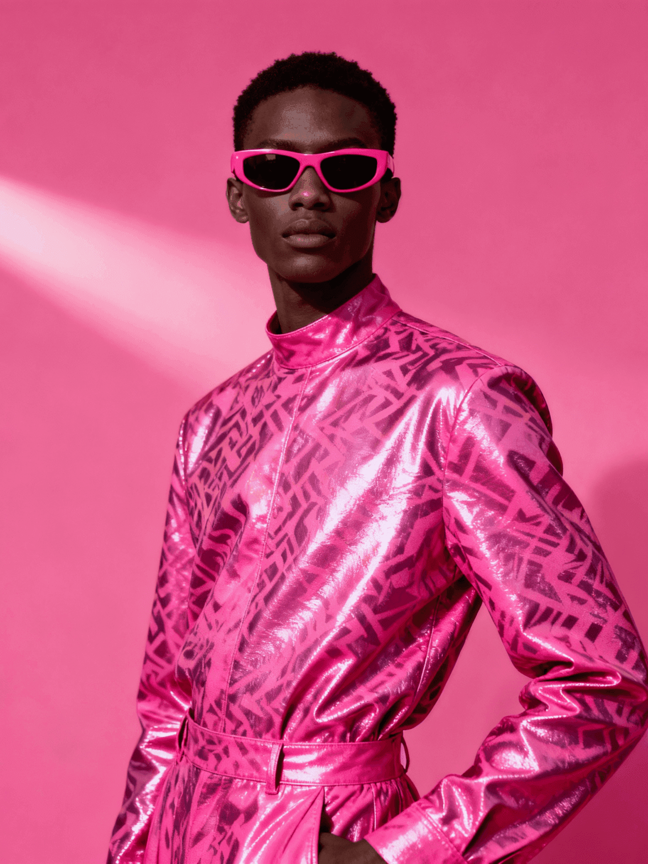
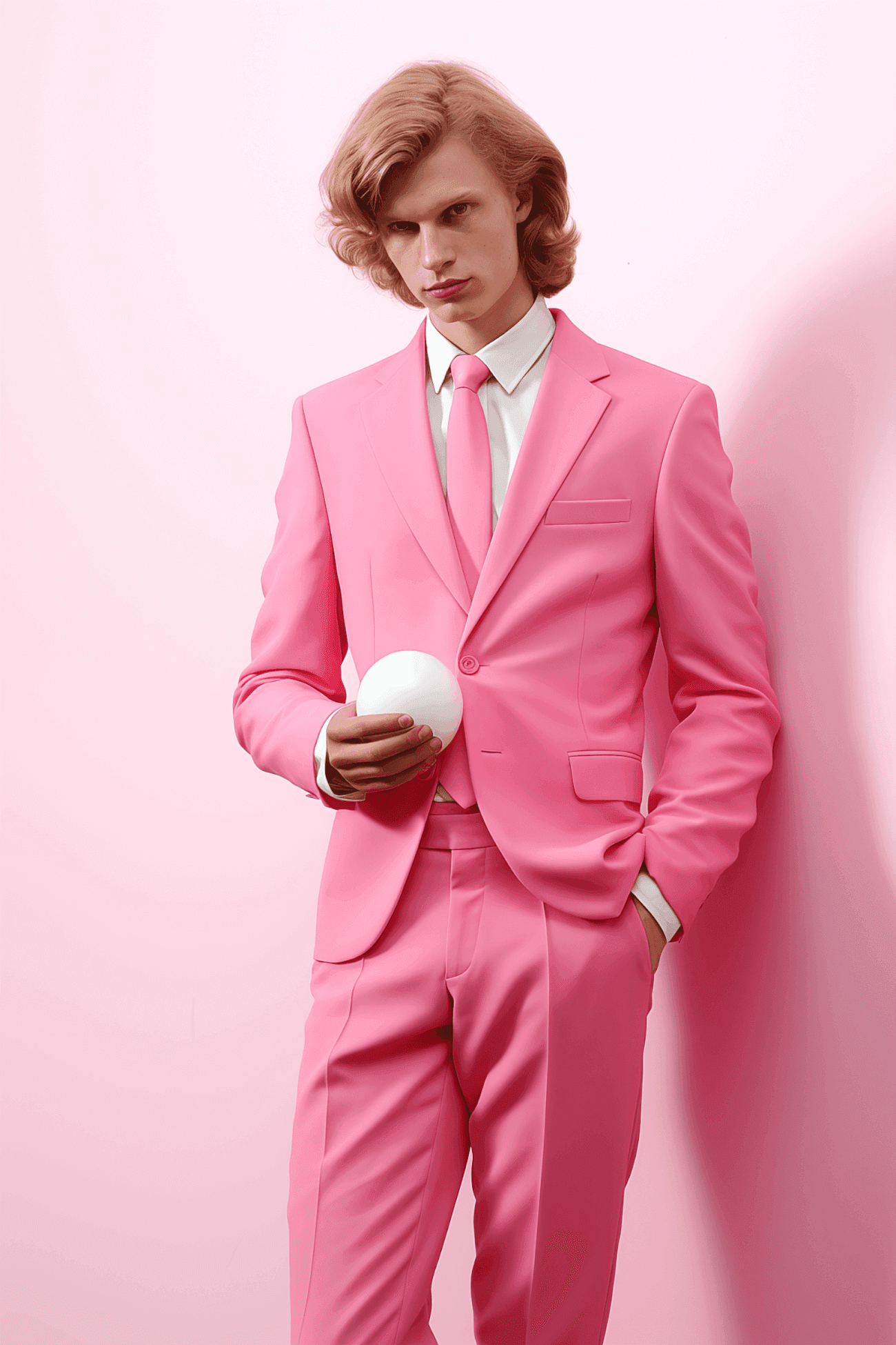
Softness as Strength
Pink Bloom challenges the assumption that soft means weak. This brand system for a creative studio uses blush, rose, and dusty petal tones not as decoration but as a deliberate stance — a rejection of the hard-edged, high-contrast aesthetic that dominates the industry. Photography was styled to feel intimate and unhurried. The result is an identity that stands out precisely because it refuses to shout.
Details That Build the World
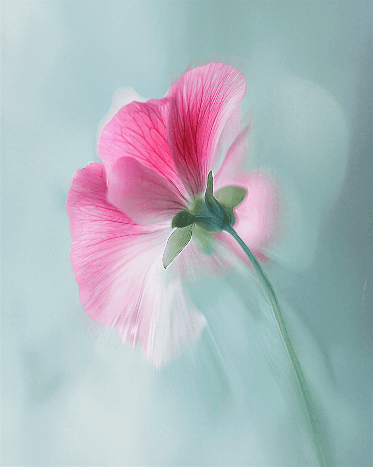
The identity rollout included custom lettering drawn from the organic curves of botanical illustration, a bespoke icon set based on growth stages of the peony, and a photography art direction guide covering lighting, composition, and prop selection.
The studio's social presence was redesigned around the same principles — each post treated as a frame within a larger, coherent visual world rather than a standalone piece of content. Six months after launch, unprompted brand recognition among the target audience had tripled.